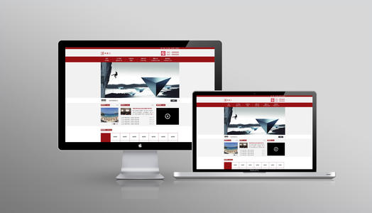
Web pages can be said to be the basic elements of a website. When we click the mouse and roam in the Internet, a pair of wonderful web pages will appear in front of us. Then, what are the factors that make the web pages wonderful or not? Color matching, text changes, picture processing, etc. of course, these are factors that can not be ignored. In addition to these, there is a very important factor - the layout of web design. Next, let's talk about the layout of web design.

1. "Guo" font
It can also be called the "same" font, which is the favorite type of some large websites, that is, the top is the website title and banner advertising strip, and then the main content of the website. There are two small pieces of content on the left and right, the middle is the main part, which is listed together with the left and right. At the bottom is some basic information, contact information, copyright notice, etc. of the website. This structure is almost the most structure type we see on the Internet.
2. Corner type
In fact, this structure is only a formal difference from the previous one. In fact, it is very similar. There are titles and advertising banners on the top, a narrow column of links on the left, a wide text on the right, and some auxiliary information of the website below. In this type, a very common type is that the top is the title and advertisement, and the left is the navigation link.
3. Title Text Type
This type, that is, the top is the title or something similar, and the bottom is the body, such as some article pages or registration pages.
4. Cover type
This type is basically the home page of some websites, most of which are exquisite graphic design, combined with some small animation, put a few simple links or just an "entry" link, and even link directly on the picture of the home page without any hint. Most of these types are enterprise websites and personal home pages. If they are handled well, they will bring people a pleasant feeling.
5. "T" structure layout
The so-called "t" structure layout refers to the combination of the upper and left sides of the web page, the top of the page is a horizontal bar, the website logo and advertising bar, the lower left is the main menu, and the content is displayed on the right. This is the most widely used layout in web page design. In the actual design, the form of "t" structure layout can also be changed, such as the left and right two column layout, half of which is the text, and the other half is the image picture and navigation. Or the text is arranged in two columns, distinguished by background color, and pictures and text are placed respectively.
This layout has its inherent advantages. Because people's attention is mainly in the lower right corner, most of the letters that enterprises want to publish to users can be obtained by users with the greatest possibility, and it is very convenient. Secondly, the page structure is clear, the primary and secondary are clear and easy to use. The disadvantage is that the rules are rigid. If you don't pay attention to the details and colors, it's easy to make people "look tasteless".
6. "Mouth" layout
This is an image statement, which means that there is an advertising bar at the top and bottom of the page. The left is the main menu, the right is friendship links, and the middle is the main content.
The advantage of this layout is that the page is full, the content is rich and the amount of information is large. It is a common layout of comprehensive websites. In particular, the row of small icons in the center of the top plays a role in activating the atmosphere. The disadvantage is that the page is crowded and not flexible enough. There are also four sides to be vacated and only the middle window design is used. For example, Netease wallpaper station uses multi frame form. Only the central part of the page can scroll, and the interface is similar to the game interface. There are multi-dimensional game entertainment websites using this format.
7. "Three" layout
This layout is mostly used for foreign websites, but not much at home. It is characterized by two horizontal color blocks on the page, which divides the whole page into four parts, and most of the color blocks put advertising strips.
8. Symmetrical contrast layout
As the name suggests, it refers to a symmetrical layout, half dark and half light, which is generally used for design websites. Its advantage is strong visual impact, but its disadvantage is that it is difficult to organically combine the two parts.
9. Pop layout
Pop comes from advertising terms, which means that the page layout is like a publicity poster, with a beautiful picture as the design center of the page. Commonly used in fashion websites, the advantages are obvious: beautiful and attractive, but the disadvantage is slow.
